

Usage
Import the Gleap SDK in your app. This will register a custom web component. You can then add the following web component to your app, to display your desired checklist.Available attributes
checklistId: This is the ID of your checklist info: Show / hide the info label progressbar: Show / hide the progress bar dark: Toggle dark mode floating: Enable floating mode sharedKey: Sync a checklist accross resourcesShared key
Use thesharedKey property to synchronize checklist progress across multiple resources.When any user updates a checklist that has the same
sharedKey, everyone else—no matter which widget, page, or device they’re on—will immediately see the updated status.
- Collaboration made easy | Perfect for project dashboards, sprint boards, or any place where several people need to track a single source‑of‑truth checklist.
- One key, one state | All instances that share the key stay in lock‑step; remove the key and each checklist becomes independent again.
- Zero extra code | Just add the same
sharedKeyvalue wherever you want progress to be shared.
Floating checklist component
If you want to add the checklist to the navbar or sidebar, just enable the floating option by adding the floating attribute.Dark mode
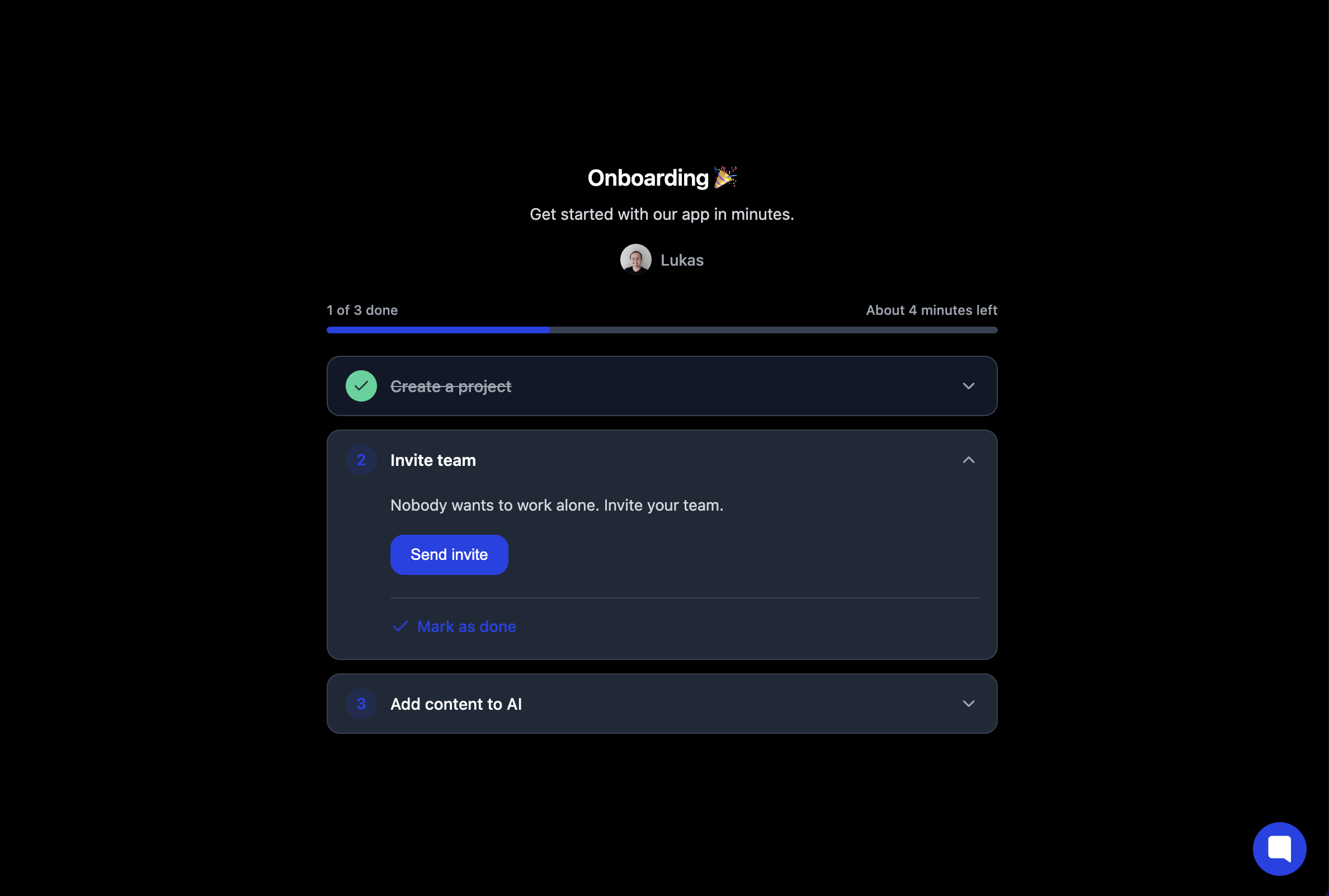
You can toggle the dark mode by adding thedark="true" attribute.
TypeScript (React, Vue, Angular)
To enable full TypeScript support for the<gleap-checklist> custom element, add the following declaration to your global.d.ts file:
Custom CSS
The<gleap-checklist> component uses Shadow DOM to encapsulate its internal styles. To allow customization, it exposes specific elements via the part attribute.
You can override these styles globally using the ::part() pseudo-element.